Some nights the onions are already in the pan when I realize I'm out of garlic. So I do what New York lets you do: turn the burner down, walk to the corner store, get back before anything sticks. A grocery, a pharmacy, a slice — all close enough to be an afterthought. That kind of proximity is so ordinary here you stop seeing it. This chapter is about what it hides.
Because the things you can't solve with a two-minute walk are the ones that matter most. Take community district 405 — Ridgewood and Maspeth, a dense slice of central Queens of about 181,000 people. Every resident is within a ten-minute walk of a licensed childcare program; on the proximity map this chapter starts with, it's a success story. Then you count the seats: CD 405 has roughly 23 childcare slots for every 100 children under five, the lowest ratio of any community district in New York. The day care is around the corner. There is no room in it.
That gap — between within reach and enough — is the whole chapter.
This is the fourth chapter in a series measuring New York at the resolution that actually decides things. Chapter 1 measured the city in minutes, Chapter 2 in dollars over income, Chapter 3 in what the body absorbs by being there. This one is the most domestic: the errands you can't skip, and whether they happen on foot or require a car and an afternoon.
Why daily needs deserves its own chapter
The first three chapters measured things a household mostly can't choose: the commute the transit map hands you, the rent the market sets, the air you breathe. Daily needs feels different — like the one thing you can choose, just by picking the right neighborhood. Find a block with a grocery, a clinic, and a school, and you're set. That's the promise of the 10-minute city — every daily need within a ten-minute, half-mile walk. And in New York the promise is largely kept — across the five boroughs, most people really can reach most things on foot. So if proximity were the whole problem, this would be a short chapter.
It isn't — and the half that's left is the half that decides whether a household actually works. Being near a grocery, a clinic, a day care is not the same as getting fresh food, an appointment, an open seat. That gap falls hardest on the households with the least slack: families with young children, who need a childcare seat and a school and a pediatric clinic at once, on the same budget of time and money. Naming the gap is easy; measuring it — telling nearby apart from enough — is the hard part, and it's where the chapter has to start.
Why daily needs is hard to measure
Start with the obvious metric: how close do people live to what they need? For each district, measure the share of residents within a ten-minute walk — 2,640 feet, the half-mile bar behind the 10-minute city — of a full-service grocery, a pharmacy, childcare, a clinic, a school, a library, a park. Sort those into three baskets — food, care, and civic — and you have a tidy three-dimensional map of access.
The trouble is that the three dimensions aren't really three. Rank New York's 59 districts on each basket and the three orderings come out almost identical — so alike that they nearly fail the chapter's check for whether two measures are secretly the same thing. The reason is no mystery: all three are walk-access measures, and walk-access is mostly a restatement of population density. Where more people are packed in, more of everything is packed in with them. The three dimensions turn out to be one dimension wearing three coats, and that dimension is how dense your block is.
Which means the easy metric measures the wrong thing. This chapter uses proximity for what it honestly is — a density map — and turns to the question density can't answer: of the things that are close, are there enough to go around?
That question is harder to ask, because most daily needs don't come with a count. Childcare is the exception: programs report capacity, so you can divide slots by children and read a sufficiency ratio off each neighborhood. Even then the data sets a trap. Two regulators split the job — NYC's Health Department licenses the center-based programs, while New York State's OCFS registers home-based family day care and lists no centers at all inside the five boroughs — so leaning on either source alone misses roughly half the seats. Stitched together, they come to 246,851 licensed slots for the city's 498,130 children under five.
The map
The map has six views. The first two ask how close people live to what they need — a full-service grocery, then the whole daily-needs basket. Fresh-food access asks whether that nearby store is a real grocery or just a bodega. Childcare sufficiency drops closeness for capacity — seats per child. Walkable vs served puts both questions on one map: the red districts are the chapter's answer, the places you can walk to everything and still can't get a seat. And Daily-needs score rolls it into a single honest ranking — proximity and sufficiency multiplied, so neither can fake the other. Watch the city go from nearly uniform to wildly uneven as you move from close to enough.
On the two proximity tabs, most of the city is dark: outside the low-density edges — Staten Island's south shore, eastern Queens, Co-op City — nearly everyone can walk to nearly everything, and the worst-access districts are the same handful that bottom out Chapter 1's mobility ranking. Switch to Childcare sufficiency and the map shatters into an unrelated order: dense, walkable Queens goes pale (too few seats) while the Bronx — middling on everything else in this series — holds the best-supplied districts in the city. Being near childcare and having a seat are almost unrelated: the two rank-correlate at just ρ = +0.37.
The Walkable vs served tab is the chapter on one map. Each district answers two yes/no questions: is it walkable — can most residents reach daily needs in ten minutes — and is it served, meaning it has at least the median district's childcare seats per child. (Undersupplied is the flip side: fewer seats per child than that median.) Of 59, 30 are walkable and served and 10 are car-dependent and undersupplied — but 19 are walkable but undersupplied: a short walk from everything, yet stocked with fewer childcare seats per child than the typical district, which itself has room for only about half its kids. One quadrant sits empty — not a single district is car-dependent yet well-served. Low density costs you twice: you can't walk to it, and there isn't enough of it when you drive.
If you do want a single ranking, the Daily-needs score tab is the honest one — honest because it refuses to let proximity stand in for access. It multiplies each district's proximity rank by its sufficiency rank, so a low mark on either drags the whole score down, the way a day care you can't get into is no day care at all. Rank the city this way and the proximity darlings fall hardest: Central Harlem drops from 1st on proximity to 24th overall, East Harlem from 11th to 44th. The districts that top it — the Upper West Side, the Lower East Side, Fort Greene — are the ones that were never just walkable.
Five neighborhoods
Five community districts, one per borough, at the corners of the chapter's argument. Proximity rank is the combined walk-access score (1 = most reachable); childcare is licensed seats per 100 children under five; and the daily-needs score folds proximity and sufficiency (childcare plus fresh-food access) into one 0–100 ranking — multiplied, not averaged, so a weak mark on either half drags it down. All ranks are out of 59. Watch Belmont: best-in-class on childcare, yet only mid-pack overall once its bodega-heavy shelves count against it.
| CD | Neighborhood | Boro | Proximity rank | Childcare / 100 (rank) | Daily-needs score (rank) |
|---|---|---|---|---|---|
| 405 | Ridgewood / Maspeth | QN | 48 | 23 (59, worst) | 8 (58) |
| 316 | Brownsville | BK | 16 | 33 (53) | 59 (21) |
| 112 | Washington Heights / Inwood | MN | 17 | 81 (5) | 75 (11) |
| 206 | Belmont / East Tremont | BX | 25 | 90 (2) | 55 (23) |
| 503 | Tottenville / Great Kills | SI | 59 | 24 (58) | 7 (59) |
Use the tabs below — selecting an anchor highlights it on the map and surfaces its detail.
Ridgewood / Maspeth (CD 405) is the chapter's cold open and its central inversion. Every resident is within a ten-minute walk of childcare, and it sits mid-pack on overall proximity (48th of 59) despite being an outer-borough CD. Yet it has the fewest childcare seats per child in the city — 23 per 100 under-fives. A dense, working, immigrant-heavy stretch of central Queens: exactly the family neighborhood the "walk to everything" framing flatters and the seat count indicts. The day care is on the block. The waitlist is the point.
A store is not a grocery
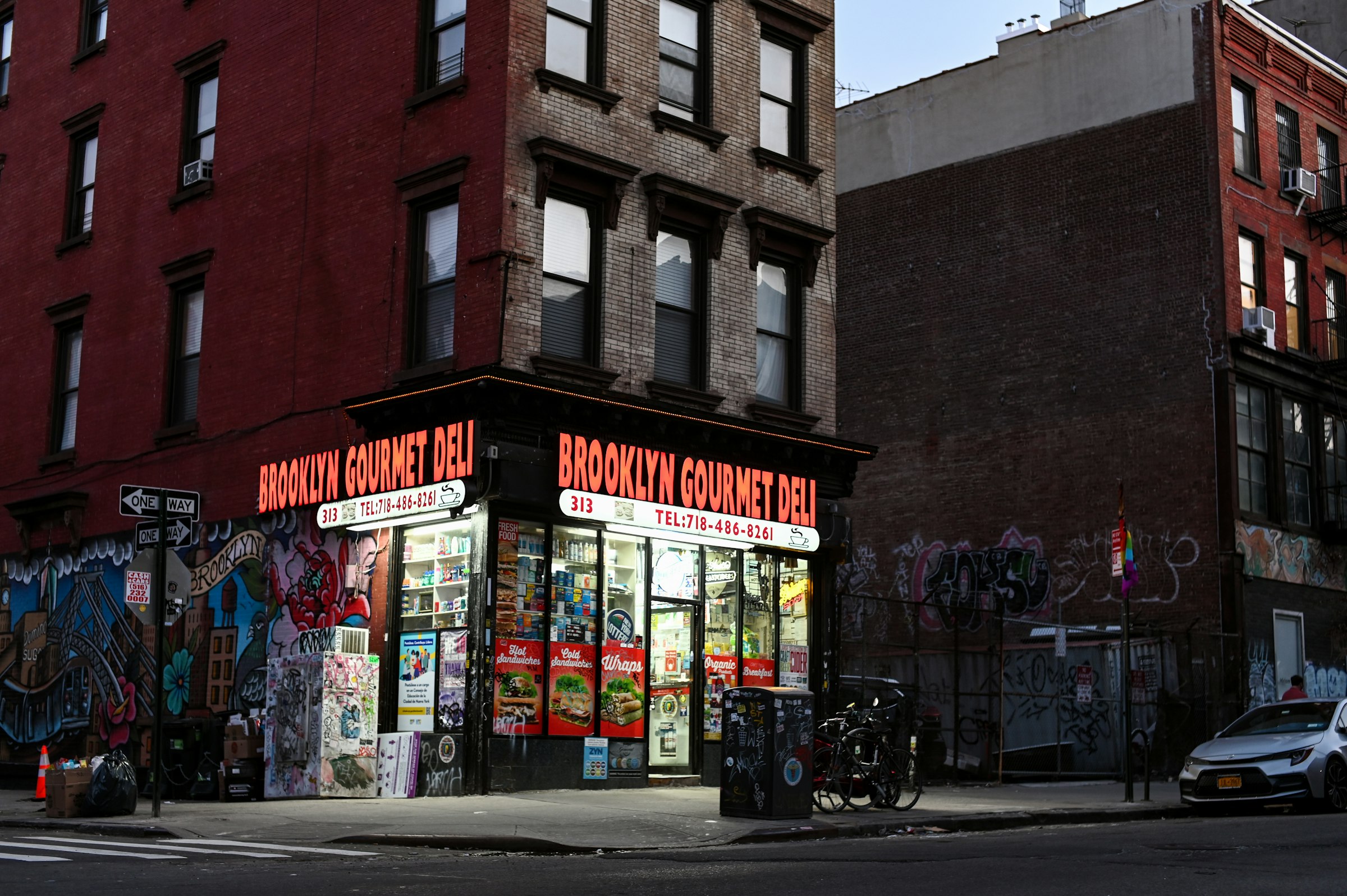
There's a second gap behind the food map — the one my mid-recipe dash depends on. The corner store works because it's there, but a corner store is exactly that: it'll sell me garlic in a pinch, not a week of fresh produce. Citywide, five of every six licensed food stores are too small to be a full-service grocery — 84% are bodegas and corner stores, about five for every grocery. Proximity to a store is not proximity to fresh food. (The food map already builds that in: it counts only groceries of 5,000+ square feet, not the bodega on the corner.)
Switch to the Fresh-food access tab and the bodega-dominated districts aren't the outer-borough errand deserts — those, sparse as they are, skew toward groceries. They're dense, walkable, lower-income neighborhoods: South Crown Heights, where just 5.6% of food stores are full groceries (17 bodegas per grocery), plus Morrisania and Borough Park. And — fittingly — Belmont/East Tremont (CD 206), the district with the city's best childcare supply, has nearly its worst fresh-food mix: 7% groceries, 13 bodegas to one. You can reach a food store in Belmont in two minutes; what's inside is the question. The disparity is documented — the city's own data puts the ratio of bodegas to full groceries near 18-to-1 in the poorest neighborhoods versus 3-to-1 on the Upper West Side — and bodega shelves run to snacks, not produce. The same walkable but not served gap as childcare, measured on the shelves.
The contradiction
The neighborhoods that look most accessible are often the least. Pack groceries, clinics, schools, and day cares into a few dense, walkable blocks and every proximity map glows — but proximity only asks whether a thing is near, never whether there's enough of it. Those are different questions, and across New York they barely agree.
The chapter has hit that gap from both sides. On childcare, seats per child swing almost four-fold from one district to the next, yet hardly track how walkable a neighborhood is (ρ = +0.37) — or how rich it is, with the poorest districts at both ends. On the shelves, the store you can reach in two minutes is five-to-one likely to be a bodega, not a grocery. So the places that look perfectly served on a map can be the ones running shortest on what's actually there — and that's exactly why the shortfall hides.
What this means for a household
If you're choosing where to live, the chapter cashes out to two habits:
- Don't be impressed that everything's a short walk — walk into the places. In most of New York, "a grocery and a pharmacy and a day care nearby" is the baseline, not the selling point. What actually varies sits one layer down: is the "grocery" a real one or a bodega with a wall of chips? Does the day care have an open seat, or a two-year list? The block looks the same either way; the insides don't.
- If you have small kids, treat childcare like the commute. Seats per child swing four-fold across the city, and they don't follow the obvious cues — not income, not how nice the neighborhood looks; some of the best-supplied districts are in the South Bronx. Call the local programs and ask about waitlists before you sign a lease, the way you'd check the train before taking a job. The seat count, not the walking distance, is the number that will run your week.
What this measure misses
Several caveats worth holding, with the full list in Chapter 10:
- Proximity is not quality or affordability. A grocery within ten minutes says nothing about its prices or produce; a clinic nearby says nothing about whether it takes your insurance. The 5,000-sq-ft grocery threshold (see A store is not a grocery) is a rough stand-in for "full-service," not a measure of what's on the shelves — a 5,001-sq-ft store with no produce section still counts.
- Slots are licensed capacity, not enrollment or affordability. The childcare ratio counts seats a program is licensed to fill, not seats actually open — nothing about cost, subsidy, hours, or quality, and a neighborhood can have seats no local family can afford. OCFS home-based capacity also folds in some school-age care (the under-5 breakdown is unusable in the five boroughs), so the ratio modestly overcounts under-5 supply where home-based care dominates.
- Straight-line walks ignore the street network. Ten minutes "as the crow flies" doesn't know about rivers, highways, or dead-end blocks — the caveat flagged in Chapter 3's park metric. A walk-network distance would trim coverage at the edges.
- CD averages hide block-scale deserts. A district can read "served" on average while a corner of it is a real desert — the intra-CD variance Chapter 1 surfaced with per-tract isochrones applies here too.
Reach for the next chapter
Chapter 5 is Public Space & Urban Experience — not whether the necessities are within reach, but what the city feels like to move through once they are: parks and plazas, sidewalk width, storefront density, the streets given back to people. This chapter measured the errands that keep a household running; the next measures the city you live in when you're not running errands — and asks whether the neighborhoods easiest to supply are the ones best to be in.