In the Heights opens at sunrise on Washington Heights. Usnavi rolls up the bodega gate; the No. 1 train rattles overhead; the piragua cart hawkers are already competing for the corner; the fan inside the store is broken. By the time the second number starts the audience has been told, without being told, the central fact about that block: its environmental texture — the heat, the noise, the density of bodies and traffic and music on the same hundred feet of sidewalk — is inseparable from what makes it home. The musical's emotional argument is that the block's burden and its love are the same thing.
The chapter's argument is more boring than that, and it agrees with the musical. Environmental burden and unlivable neighborhood are not the same map. The community districts with the worst measured air quality in New York are not the worst places to live in New York; they are the densest, the most occupied, the most full of the activity that produces the burden in the first place. The community districts that file the most environmental 311 complaints aren't the noisiest by any sensor-driven measure of noise; they're the blocks where the most people are bothered enough to call.
This is the third chapter in a series that tries to measure New York at the resolution that actually decides things. Chapter 1 was the city as a function of minutes. Chapter 2 was the city as a function of dollars over income. This one is about the city as a function of what the body absorbs by being there: the air, the heat-and-quiet of having or not having a park, and the volume of complaint about environmental conditions that the rest of NYC's bureaucratic record-keeping captures.
Why environmental quality deserves its own chapter
The household choices the first two chapters measured — how far you can get in 45 minutes, what share of your paycheck the landlord takes — are choices you can re-make. Environmental exposure is the chapter where most of the levers stop working. You don't get to opt out of the air on your block. The trees near your apartment are the trees near your apartment. The cumulative noise on a given corner is a function of the corner, not of your behavior. The block does the work for you, and the WHO classifies several of those passive exposures — sustained PM 2.5, chronic traffic noise — as independent risk factors for cardiovascular disease.
The temptation in this category is to reach for a single "environmental quality" index — air plus parks plus noise, weighted somehow, ranked. That was the wrong move for housing too, where median rent flattened a problem that had several dimensions. The hypothesis going in here was that air quality, green-space access, and the volume of environment-related 311 complaints are three semi-independent dimensions, and that the interesting contrasts in NYC are about which pair of them a given neighborhood loses on — not about a single composite. The data, when it comes back, agrees.
How environmental quality is measured in this chapter
All three dimensions pass the chapter's kill test — no pair of them ranks together tightly enough to collapse the chapter. Air and green-space track each other loosely; air and complaint volume more so; green-space and complaints barely at all. They're measuring different things, and the city looks different from each one.
One quick definition the rest of the chapter assumes: park access means a resident lives within a half-mile straight-line walk of an NYC-Parks-mapped public park of at least one acre.
What that includes and excludes is editorial, so it's worth being concrete:
- In: Central Park, Prospect Park, Inwood Hill, Fort Tryon, Highbridge, the Riverside Park stretch — and every neighborhood park, community park, flagship park, larger playground, and nature area that hits the one-acre cutoff. The High Line counts (6.7 acres, DPR-mapped). A handful of DPR-managed cemeteries and historic-house grounds count too.
- Out: the city's many sub-acre triangles, plazas, and community gardens (dropped by the size cutoff); private parks like Stuyvesant Town's interior courtyards; schoolyards outside the DPR system; and NYCHA-managed open space. A typical community garden is out (too small); a typical neighborhood ballfield is in.
The catch is on the third dimension, and it surfaced during the build. A straightforward call-count metric — environmental 311 complaints per resident per year — turns one Bronx zip code (10466, Wakefield) into roughly 11% of New York's entire noise-complaint volume, 97% of it the descriptor Loud Music/Party. An independent analysis by Haejin Son identifies the same chronic-caller pattern: a single address inside the zip accounts for about 13% of the zip's noise complaints on its own, and the rest of the anomaly turns out to be only partly explainable by demographics, holidays, or duplicate entries. Her piece names the diagnostic and leaves it there.
This chapter takes the diagnostic as given and responds with a metric switch. It counts how many distinct addresses on a block file at least one env-311 call, not how many calls came in. The metric stops pretending it's measuring acoustic exposure and starts measuring the thing 311 actually captures: how widespread the behavior of calling about environmental conditions is on a given block.
The map
The three dimensions of the chapter, on one map. Toggle between them to see how the geography rearranges itself depending on what you're measuring.
On the air-quality tab, the shape is the shape of density and traffic: Manhattan below 96th Street is the darkest part of the city; Staten Island's south shore, the Rockaway peninsula, and outer-coastal Brooklyn are the lightest. Switch to Park access and a completely different map appears — south Brooklyn and southeast Queens darken (worst access) while the rest of NYC reads near the ceiling. Switch to 311 complaints and the map rearranges again — Manhattan core and brownstone Brooklyn lead; the Bronx, despite a popular reputation, sits in the middle. Three dimensions, three different maps, no single CD that loses on all of them.
Five neighborhoods
Five community districts, picked to anchor each corner of the chapter's measurement space. The first column after the borough — residents / sq mi — is the chapter's aliveness measure: how many people live on the same square mile. Think of it as a floor. The ceiling is daytime population (workers + visitors), which we don't measure here but flag in the Midtown anchor below, where it matters most. Rankings are out of 59 CDs; "above WHO" is how far each CD's PM 2.5 sits over the WHO's 5 µg/m³ clean-air guideline.
| CD | Neighborhood | Borough | Residents / sq mi | Air quality | Park access (10-min walk) | 311 complaint volume |
|---|---|---|---|---|---|---|
| 105 | Midtown | MN | 45,500 (#28) | dirtiest in NYC (67% above WHO) | 100% (Central Park) | 2nd-most in city |
| 112 | Washington Heights | MN | 67,400 (#11) | middle of pack (40% above WHO) | 100% | middle of pack |
| 206 | Belmont / East Tremont | BX | 55,700 (#17) | middle of pack (40% above WHO) | 100% | middle of pack |
| 311 | Bensonhurst | BK | 48,700 (#25) | cleaner half (29% above WHO) | 84% — 3rd-worst | 2nd-quietest in city |
| 503 | Tottenville | SI | 7,800 (#58) | cleanest in NYC (22% above WHO) | 100% | quieter than 45 CDs |
Each one is its own story. Use the tabs below to explore — selecting an anchor highlights it on the map and surfaces its detail.
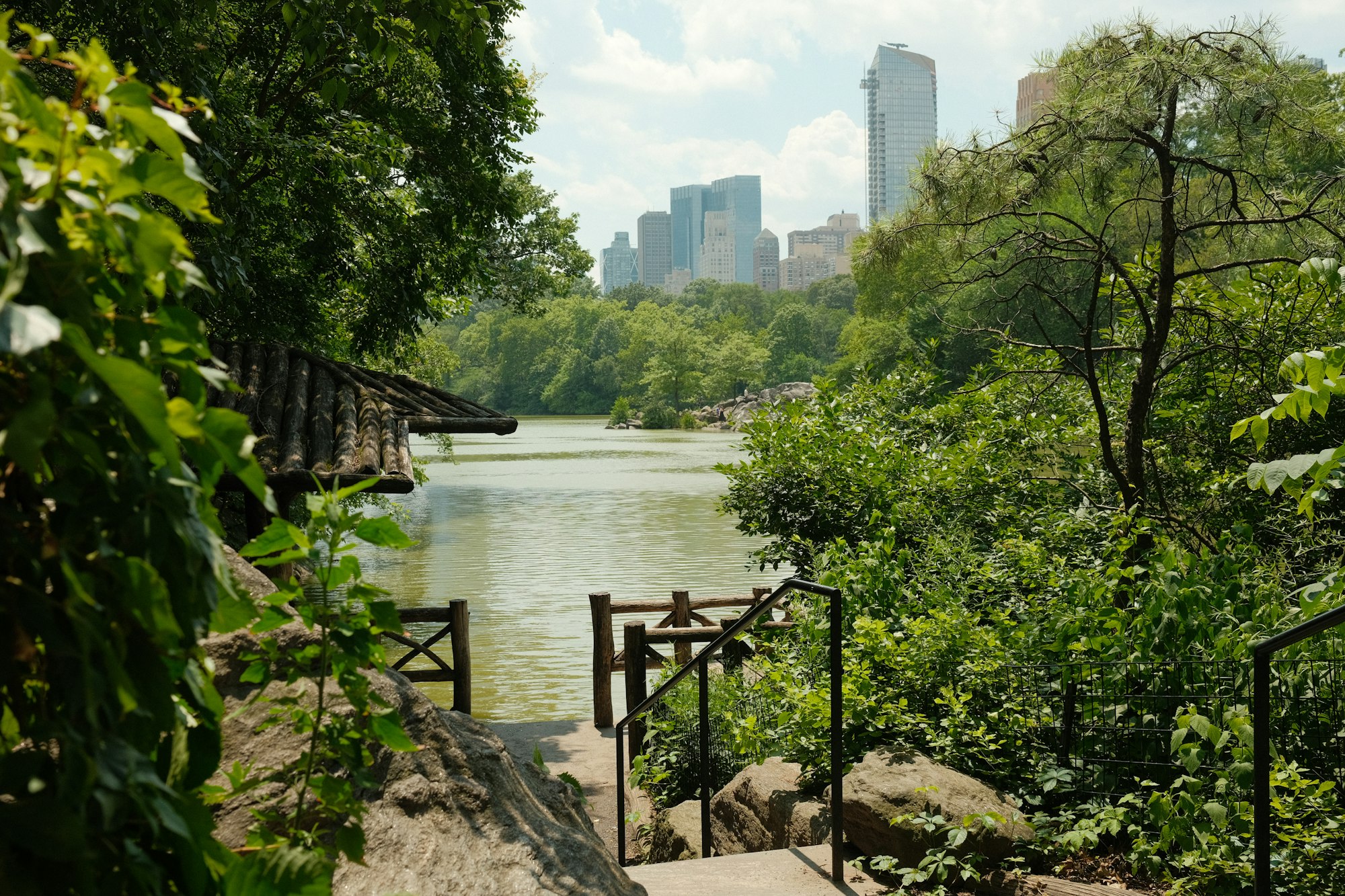
Washington Heights / Inwood (CD 112) is the chapter's cold open and its central inversion. The data ranks it middle of the pack on every dimension it measures — air is middle, parks are 100% within reach (Fort Tryon, Highbridge, Inwood Hill, the Riverside Park stretch), 311 complaints are middle. None of those numbers, on their own, would put CD 112 in a chapter about environmental burden.
And yet 189,000 residents share these blocks at 67,400 per square mile — rank 11 of 59, top fifth of the city on residential density — and In the Heights spends two and a half hours dramatizing the environmental texture that results: heat, traffic, music from the open window upstairs, the No. 1 train overhead, a thousand people on the same corner. None of that shows up in the rankings. The data says CD 112 is environmentally average. The lived experience says it isn't. That gap — between measured burden and experienced burden — is what the chapter is about.
The contradiction
Three different dimensions, three different ranking orders, no single CD that loses on all three. CD 105 loses on air and complaint breadth but has Central Park; CD 311 loses on green-space and would not register on the air or complaint maps; CD 112 doesn't lose on any dimension by the numbers but is the part of the city that In the Heights spends two and a half hours describing as environmentally textured. The data isn't telling you which neighborhood is worst-off. It's telling you that environmental burden doesn't have a worst-off neighborhood — it has dimensions, and the dimensions don't agree.
The deeper contradiction is on the third dimension. NYC 311 noise records are sometimes treated as if they describe a city's acoustic environment, the way air-quality readings describe the city's atmospheric chemistry. They don't. The aggregate record describes who is bothered enough to file. That's a real and useful signal — civic-complaint breadth is a meaningful proxy for how widespread environmental friction is on a block. But it's an aggregate of behavior, not exposure, and the chapter that pretends otherwise gets fooled by the first chronic-caller it meets.
What this means for a household
Don't reduce environmental quality to one number. The CD that ranks #1 on air pollution (Midtown) is also where Central Park is across the street and where one of the most transit-rich addresses in North America is. The CD that ranks last on air pollution (Tottenville) is where every errand needs a car. The map of environmental burden is the map of where the engines of New York are running — they have different costs and different compensations, and no single ranking spares you the work of weighing them.
What this measure misses
Three caveats worth holding in mind, with the full list in Chapter 10:
- The noise dimension measures behavior, not loudness. It counts how many addresses on a block bother to call 311, which is correlated with but not the same as acoustic exposure. A neighborhood with many lightly-annoyed neighbors reads higher than a neighborhood with one chronic noise source.
- The green-space metric runs out of room at the top. Most NYC CDs hit 95-100% coverage of the ten-minute-walk-to-a-1-acre-park standard. The metric discriminates clearly at the green-poor end (south Brooklyn, southeast Queens) but compresses near the ceiling; a tighter cutoff would spread the upper end out further.
- CD-level air numbers smooth over the block scale. DOHMH publishes air data per community district by interpolating a sparser sensor network with traffic-and-land-use covariates. The CD value describes a typical exposure for residents; a household within a quarter-mile of a truck route sees something different from the CD average.
Reach for the next chapter
Chapter 4 is Daily Needs — the geography of getting groceries, medicine, and a primary-care visit without a car. Mobility (Chapter 1) was the geography of what's reachable; this chapter measured what fills the lungs and what fills the ear; the next one asks the smaller, more tactical question of whether the day-to-day errands of holding a household together happen within walking distance. Whether the daily-needs map agrees with the burden gradient this chapter just drew, or runs perpendicular to it, is the interesting question for that one.