There's a question about a city that sounds simple and isn't: how big is the world from where I live? New Yorkers know intuitively that two apartments in different neighborhoods, equidistant from the same job, are not equidistant in any sense that matters. The standard metric — miles — gets the geography right and the lived experience wrong. The metric that gets the lived experience right is minutes, and minutes are a function of when you leave, what trains are running, where you can walk to, how well the connections line up, and a hundred other things that vary by the block.
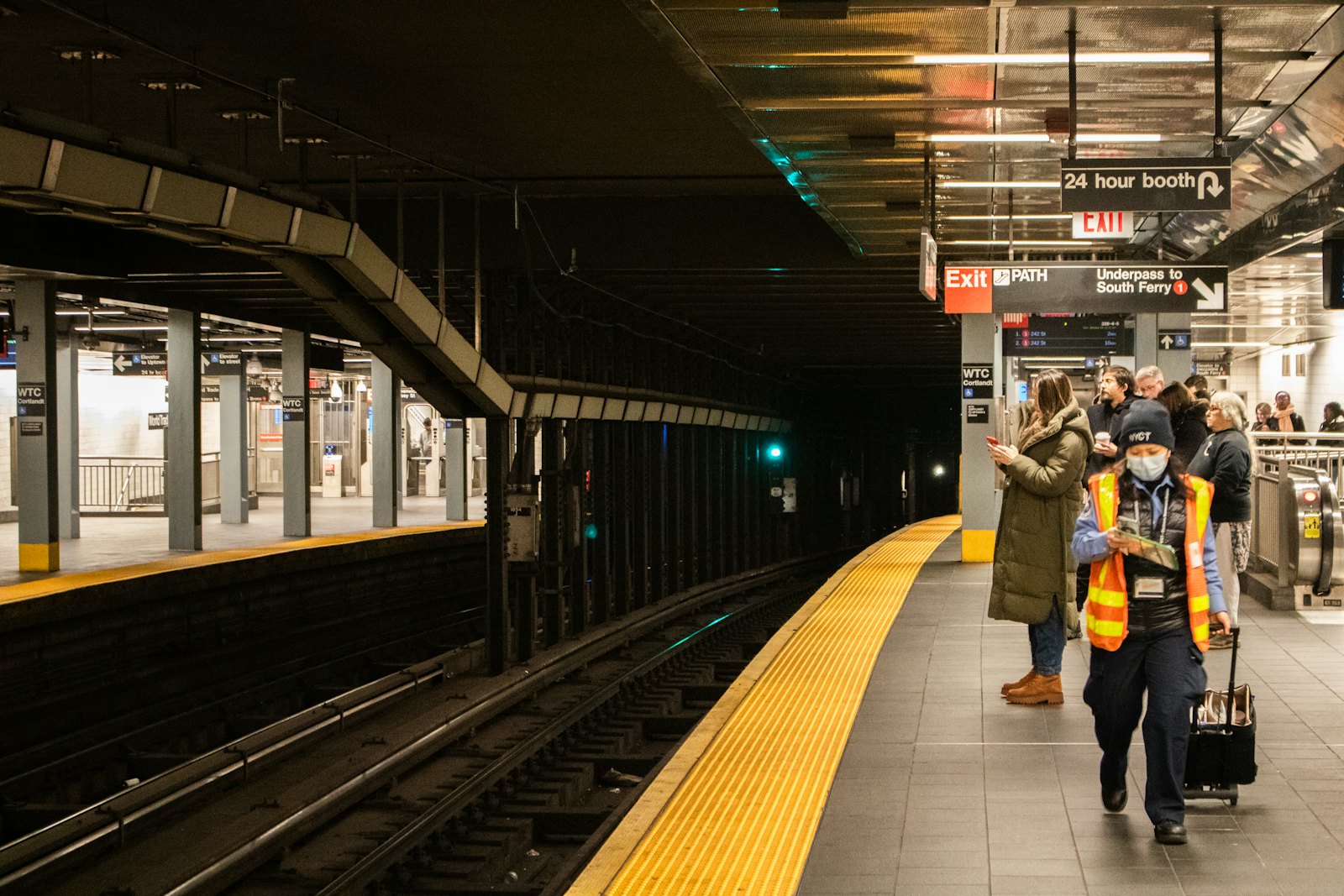
The MTA, like most transit agencies, publishes its full schedule as GTFS. The whole subway system — every line, every stop, every scheduled trip — is a 5.8 megabyte download, refreshed weekly. That makes the minutes question answerable in a way it isn't in most cities.
This chapter is an attempt to draw a map of what New York looks like in minutes. Specifically: from any given point in the city, how many jobs can you reach in 45 minutes by subway and walking, departing Tuesday at 8 AM? I computed this for all 2,303 NYC census tracts, aggregated to community districts, and the answer is more uneven than I expected.
Why mobility deserves its own chapter
In a dense city, transit is opportunity access in a way it isn't in a place where most people drive. If you live somewhere you can reach 3 million jobs in 45 minutes, the entire NYC labor market is, in a real sense, available to you. You can take a job because the pay is right, not because the commute is feasible. You can take a job that doesn't exist yet in the form of a meeting that turns into work. Your children can take after-school activities that aren't within walking distance.
If you live somewhere you can reach 13 thousand jobs in 45 minutes — about 0.3% of the city — the calculus inverts. The job market that's effectively available to you isn't the city's job market. It's the local one. The pay floors are lower, the variety is narrower, the upward path looks shorter from the inside. You can take other jobs, of course. They just cost you time, every weekday, for as long as you hold them. And time spent commuting is time not spent on anything else — sleep, family, a side project, a class.
There's a useful way to think about this. Every minute spent in transit is a tax you pay on every trip you take — and trips are not rare. Not just the commute: the grocery run, the pediatrician, the playground, the cousin in Queens, the parent-teacher meeting on a Tuesday night. A round trip that takes fifteen extra minutes doesn't sound like much on one outing. Multiplied across the four or five trips a household makes in a week, over the years they live in the place, it's the difference between getting home in time to cook and ordering takeout again. A neighborhood with a 45-minute commute to Midtown isn't 50% farther than one with a 30-minute commute. It's structurally different, because every trip — to the grocery store, the doctor, the playground, a friend's apartment — pays the same time tax. Livability is the sum of those taxes.
This chapter measures one slice of that sum: access to the place where most NYC jobs live.
How mobility is measured in this chapter
The instinct, asked how mobile a neighborhood is, is to reach for one standard number. The usual candidates: distance to the nearest subway, median commute time, and share of households without a car. Each describes something real. None of them describes the thing most households are actually asking, which is how big is the world I can reach from my front door in a tolerable amount of time?
Distance to the nearest subway describes only the easiest leg of a trip. A five-minute walk to the platform means very different things depending on which line runs through it, how often, and what you'd have to transfer to once you board. Median commute time describes the trips people take, not the trips that would be available to them — a neighborhood whose residents all settled for a 30-minute job because that was the longest commute they could stomach reads "healthy" on the commute-time table and tells you nothing about the labor market they had to choose from. Car-ownership rate, finally, describes the geography through a different city's frame; in NYC, where the median household doesn't own one, the more honest question is the inverse — what does the transit system let you reach.
The hypothesis behind this chapter is that the right measurement is the size of the opportunity set reachable from where you live within a 45-minute transit trip — and that the gap between available opportunity and taken opportunity matters more than the commute time on either side of it. The next section is on why "jobs" is the cleanest place to start measuring that opportunity set; the one after walks through how the isochrone is computed.
Why jobs, specifically
Mobility is one word that does a lot of work. It describes access to jobs, to grocery stores, to clinics, to schools, to friends and family, to parks, to the things you do when you're not working. Each of those has its own geography. Picking jobs as the headline access measure for this chapter is a choice; here's the reasoning.
Work is what most adults travel for, most days. For someone with a regular commute, job-related trips dominate the weekly budget of minutes spent moving — multiple hours, every week, for as long as they hold the job. That makes job access the highest-leverage piece of the mobility-as-time-tax frame: shrinking your job-access shed by an hour a day adds up to much more lost time over a year than shrinking your grocery-access shed by the same amount.
Jobs are unusually countable. LEHD LODES publishes job counts at the Census-block level for every state in the country. That means "how many jobs can you reach" is a real number, not a proxy. Other access measures are either coarser-grained (groceries, healthcare) or harder to define ("a good park" varies by what you want a park for). Chapters 4 and 5 will tackle daily-needs and public-space access with the right tools; this chapter takes the cleanest measurable slice first.
Job access is the available-trip side of the gap. The Census Bureau already publishes the median commute time of any CD's residents — but, as the prior section argued, that's a taken-trip number, not an available-trip one. Two residents with identical 30-minute commutes can have very different labor markets behind them: one took a 30-minute job because a million others were reachable within 45 minutes; the other took it because the 30-minute job was the only one there was. Counting reachable jobs is how you put a number on what the commute-time table can't see.
What this chapter deliberately doesn't measure: access to schools (different population, different access constraints), access to healthcare (touched in Chapter 3 on environment, more fully in Chapter 4), access to public space (Chapter 5), and the social-tie geography of where your people are — which no open dataset can capture and which is, for most of us, the most consequential geography there is. All of these are real components of mobility-as-livability. Only the job-access piece fits in a 45-minute isochrone from a tract.
How this was computed
The short version: for each of NYC's 2,303 census tracts, start at the tract's centroid, walk to any subway stop within a mile, ride the subway under its published schedule until the 45-minute budget runs out, and count LEHD LODES jobs in the area you've covered. Then aggregate the tract numbers to community districts via the median. Per-tract because CD centroids are far enough from where people actually live to give misleading numbers; median because it describes the typical resident rather than the lucky or unlucky one.
This is subway-only. Buses, which account for roughly half of NYC transit trips, aren't in the model. The 45-minute cutoff is the standard one in transit-access research (close to NYC's ~40-minute median commute, and the sweet spot where Midtown reaches ~70% of NYC jobs while Rockaway reaches under 1%). The full methodology — why 45 min, why per-tract, the catchment-radius and boarding-window decisions, the Mobility Access Score formula, and the eight long-form caveats — lives in Chapter 10 — Methodology & Limits. The analysis-repo notebook reproduces every number in this post end-to-end.
The map
This is the headline visual. Each community district is colored by the median 45-minute job-reach across its tracts. Hover any CD to see the exact median; the legend is clipped to the 5th–95th percentile to keep a couple of outliers (you'll find them) from flattening the gradient.
The shape of the map is, on reflection, the shape of the subway map. Manhattan is dark. The inner ring — Long Island City, Williamsburg, Greenpoint, Downtown Brooklyn, parts of the South Bronx — is dark-ish. Everything else fades toward the light end of the ramp, sometimes sharply. Staten Island is the lightest borough by a wide margin; Bayside (CD 411), Queens Village (CD 413), and parts of southeast Queens all the way out to Rockaway light up the same washed-out tan as Tottenville.
This isn't surprising, exactly. But seeing it on one map, with one consistent metric, changes how I read the city's geography. There's a tier of New York where the median resident can reach more than two million jobs in 45 minutes. There's another tier where they can reach less than 50,000. The line between those tiers is not subtle and doesn't follow borough boundaries.
Five neighborhoods
I picked five community districts as anchors before computing anything, on the theory that they'd cover the range. They do.
A shorthand I'll use in the table below: a CD's Mobility Access Score is the percentage of NYC's 4.5 million jobs that the median tract in that CD can reach in 45 minutes. Single-dimension — not a livability score.
After each score is a variance qualifier — uniform, moderate, or uneven — that captures how much access varies inside the CD. Each community district contains 30–50 census tracts, and a tract right next to a subway entrance can have a very different 45-minute shed from a tract a mile away in the same CD. To put a number on that internal spread I use the ratio Q3/Q1: the 75th-percentile tract's reach divided by the 25th-percentile tract's reach. A value near 1 means every part of the CD has roughly the same access; a value of 5 means top-quartile tracts reach 5× as many jobs as bottom-quartile tracts. I use a percentile ratio rather than min/max to ignore outlier tracts (a park's edge, a waterfront industrial block), and a ratio rather than a difference so the same buckets apply to CDs whose absolute numbers differ by orders of magnitude.
The buckets are uniform (Q3/Q1 < 1.5), moderate (1.5–3×), or uneven (>3×). Across all 59 CDs they break down roughly into thirds (18 uniform, 25 moderate, 16 uneven). The full eight-dimension synthesis lives in Chapter 9.
| CD | Neighborhood | Borough | Median jobs reachable in 45 min | Mobility Access Score |
|---|---|---|---|---|
| 105 | Midtown East | MN | 3,056,740 | 68 · uniform |
| 301 | Williamsburg / Greenpoint | BK | 1,483,162 | 33 · moderate |
| 212 | Wakefield / Williamsbridge | BX | 93,350 | 2 · moderate |
| 410 | South Ozone Park / Howard Beach | QN | 62,697 | 1 · uneven |
| 414 | Rockaway | QN | 18,661 | 0.4 · moderate |
Use the tabs below to explore — selecting an anchor highlights it on the map and surfaces its detail.
Midtown East (CD 105) is the contrast case. It sits on top of the 4/5/6, the E, the M, the N/R/W, the 7 — almost every line in Manhattan converges within walking distance. The median tract in CD 105 can reach 68.4% of all jobs in NYC in 45 minutes, departing on a Tuesday morning. The Q1-to-Q3 spread within CD 105 is essentially zero (2.98M to 3.09M) — every part of this CD has functionally the same access. This is the upper bound of what the NYC subway can offer you.
The contradiction
The map's strongest signal isn't between community districts. It's inside some of them.
South Ozone Park has a Q3-to-Q1 spread of 4.8× in jobs reachable from its tracts. Williamsburg's spread is 2.2×; Wakefield's is 2.3×. Midtown East's is 1.04× — almost flat. CDs with great subway access have it uniformly. CDs with partial subway access have it very unevenly, because subway lines don't run through every part of every CD.
That means the headline number for an outer CD often describes essentially no actual resident. CD 410's median of 63 thousand reachable jobs is the midpoint of a range that runs from 40 thousand to 193 thousand depending on which side of the CD you live on. Where in your CD you live often matters more than which CD you're in.
What this means for a person
If you're choosing where to live: don't pick by borough. Greenpoint (CD 301, median 1.48M jobs reachable) and Sunnyside (CD 402, median 1.07M) are not the same — but they're not 50× different either. Most of NYC's mobility variance is concentrated at the outer ring, not between the inner-ring neighborhoods.
If you're already here: moving four blocks toward the subway is often higher-impact than moving across neighborhoods. The Q1-to-Q3 spread on your CD's row in the data tells you whether that local optimization matters a lot or barely at all. In a CD like South Ozone Park, with a 5× internal spread, four blocks can change everything. In Midtown East, four blocks change nothing.
What this measure misses
Three caveats worth holding in mind when you read the headline numbers, with the full list in Chapter 10:
- Buses aren't in it. Roughly half of NYC transit trips include a bus leg; this chapter is subway-only. The numbers are best read as "what does the subway alone offer," not "what does NYC transit offer."
- Schedule, not reality. The isochrone uses scheduled GTFS, not real-time. Lines that chronically run late or lose service on weekends effectively have narrower sheds than the schedule implies. Reliability is its own analysis in Chapter 8.
- A reachable job isn't a take-able job, and the headline treats all jobs equally. A $40K teacher opening counts the same as a $400K hedge-fund seat in a "million-job shed." LODES does split jobs into three wage bands, but its top band caps at anything ≥ $40K/yr — too coarse to separate a teacher from a banker, which matters a lot in NYC. A million-job shed is the upper bound of your labor market, not the part you can compete for. Wage-resolution and sector-match work belongs to Chapter 7 (Economic Opportunity); the per-band reachable counts are stored in the published GeoJSON for the synthesis to use later.
Reach for the next chapter
Chapter 2 is Housing Stability & Affordability — rent burden, HPD violations, eviction filings, the geography of staying put. The interesting question for that chapter is whether the housing geography lines up with the mobility geography, or whether they push against each other. Spoiler: it's both, and the parts where they don't line up are interesting.